ROSEMONT, IL (June 10, 2020) – Looking for color schemes that are unique enough to catch the consumer’s eye but still feel somewhat familiar and have an element of universal appeal? Start with colors that appear most frequently in nature, said Leatrice (Lee) Eiseman, executive director of the Pantone Color Institute, in a webinar titled “Discovering Nature’s Crossover Colors,” presented by the International Housewares Association (IHA)
In what was originally scheduled as her second keynote at The Inspired Home Show, Eiseman identified 18 of these colors and shared suggestions for how to use them in unique combination with other crossover colors and trending hues.
“Nature’s crossover colors are those colors that are obvious or ubiquitous in nature, the ones that most humans have a natural positive reaction to,” says Eiseman. “They’re what I call ‘chestnuts’…the colors that are somewhat universal in their appeal and are not so trendy that we’re going to want to change them in a few years.”
Think greenery, there’s a proven physiological effect that going outside among plants and trees helps you to breathe deeper, and sky blue, no matter where you live in the world, when you look up and see a blue sky, you’re going to have a positive emotional reaction.
From the Pantone® Fashion Home + Interiors color forecast Nature’s Crossover Colors are:
- Sky Blue 14-4318
- Faded Denim 17-4021
- Navy Blue 19-3832
- Teal 17-4919
- Pineneedle 19-5920
- Seagrass 16-6008
- Pale Khaki 15-1216
- Bleached Sand 13-1008
- Light Taupe 16-1210
- Sunlight 13-0822
- True Red 19-1664
- Beaujolais 18-2027
- Eggplant 19-2311
- Dark Earth 19-1020
- Cappuccino 19-1220
- Neutral Gray 17-4402
- Charcoal Gray 18-0601
- Jet Black 19-0303
- Bright White 11-0601
- Pearled Ivory 11-0907
Current Trend Crossovers
- Rose Cloud 14-4313 (warmer)
- Blush 15-1614 (cooler)
“The psychological and emotional effects of nature’s colors are important to consider,” says Eiseman. But there’s even more to their appeal. “From a purely economic standpoint, they’re more apt to have a longer shelf-life.” In other words, nature’s colors are not going to change; they’ve got staying power.
Eiseman is always certain to point out that it’s important not to put a big umbrella over everyone’s color likes and dislikes. “One size does not fit all,” she says.
But since certain colors appear most often in nature, our eyes become accustomed to seeing them in many applications. And that’s what makes them so versatile in a wide range of color combinations. Eiseman’s presentation featured several images to help stretch the audience’s imagination about how to use these colors in surprising applications and combinations.
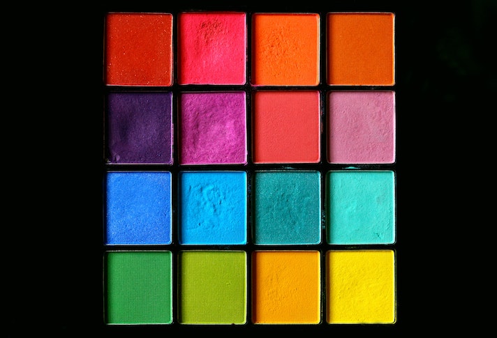
One such image featured four of nature’s crossover colors, albeit four vastly different ones that one might not typically think of going together: teal, aubergine or eggplant, sunshine yellow and peach. “It might seem strange when you say it out loud, but it makes sense when you see the image,” says Eiseman.
She went on to explain how nature’s crossover colors can also be used to extend out and embrace a color that has been trending lately. She showed several crossover colors used in combination with the blush color family, which has been making waves recently.
Eiseman also demonstrated how to use crossover colors in different applications. One example is pale khaki, which many people tend to think of as more utilitarian. Calling it a “nuanced neutral,” she showed applications for it from camping gear to a classic living room chair and said khaki can have a place in the bedroom, bathroom and kitchen, as well.
What about new or different color advice in the wake of the COVID-19 pandemic? Consumers’ buying and shopping habits might alter drastically, but Eiseman says she doesn’t see much universal change in color preferences. “It’s difficult to automatically change our ability to like or dislike certain colors,” she says.
One exception is the growing popularity of white. With so many people being more conscious of sterilization and cleanliness, “there’s more evidence of people turning to white as a refreshing, really clean color,” says Eiseman.
However, that trend can go both ways, she explains. Someone who currently has bold or bright home décor might opt for more whites or calmer hues in these times. On the other hand, someone who currently has a lot of white might yearn for something bolder or brighter to break up the monotony of sheltering at home.
Eiseman’s presentation will be not be posted on The Inspired Home Show website. Details on the Pantone color fan guides and more trend information is available at LeatriceEiseman.com.
This presentation was one of many education sessions planned for The Inspired Home Show that are being presented as free webinars for the industry. Tom Mirabile’s keynote, Innovation Theater sessions and Smart Talks programs are already posted on the Show’s website at TheInspiredHomeShow.com/education and can be viewed at any time. A schedule of upcoming webinars is available on the Show website homepage.
In addition to the educational sessions, photo galleries for the New Product Showcase, Trending Today Preview, Inventors’ Corner exhibitors and the IHA Global Innovation Awards for Product Design are posted on TheInspiredHomeShow.com. To learn about new products that were to be at the Show, visit the Show’s online directory, Housewares Connect 365, and select “Featured New Products for Media & Buyers.”