by Leatrice Eiseman, Executive Director, Pantone Color Institute
Diverse color palettes with never-ending patterns and combinations will be the name of the game more than ever before. This is where softer palettes come into play, though there is still a need to update these with unusual twists to attract attention. The popularity of health and wellness treatments, hydration and herbal tea all factor into these color groupings.
In terms of on-trend materials: Marble can be seen in everything from the interior of Infiniti’s QX concept car to wedge heels on women’s shoes. Metallic materials are especially popular when combined with an unlikely partner – wood – and texture is important, it is often needed to contrast with the sleekness of metallics. Felted products are becoming popular, as are birds and feathers.
The most important new color trends for 2020 can be grouped in eight palettes.
Metropolis
Conjuring up images of steel-girded skyscrapers, light reflecting off windows and the gritty asphalt below, Metropolis is a mix of glamour and industrial chic, combining striated old-world marble, deepened wood patinas and futuristic metallics. Accents of plum wine and elegantly deep lavender add a sophisticated touch.
Trekking
Influenced by fashion favorites of plaid flannel and well-worn denim, Trekking is a grounded palette that shows an appreciation of the outdoors. Red plays very heavily in this palette and a spicy mustard adds warmth to it.
Skill Set
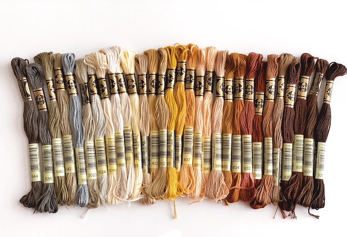
Demonstrating an appreciation of things that are hand-made, Skill Set evokes the hues of hand-thrown pottery, hand-tooled leather, forged steel treatments and wine-dyed spoons rescued from old oak barrels.
Prints Charming
This palette is inspired by an image of a modern-day Prince Charming dressed with some traditional Royal stylings but with some modern twists, including patterned tattoos. Bright blue, red and yellow are calmed by an umber brown and a minted green, and black and white provide contrast to it all.

Prints Charming
Beyond the Pale
“Taking pastels and kicking them up a notch,” Beyond the Pale shows that different permutations of pinks can co-exist, and includes a smoky green, a blue-green, a mid-tone Infinity blue, a lively greenish-yellow and a contrasting tawny brown.

Beyond the Pale
Tempered Tastes
Tempered Tastes is a palette that goes beyond just neutrals to incorporate some shimmery metallics including Pantone’s Gold Leaf and the rose-toned Agave Nectar.
Show Stoppers
The energy is palpable in this palette packed with vibrant hues such as Twinkling Diode Blue, Leprechaun Dust, Spectra Yellow and Purple Orchid. It’s a combination that kids (or kids at heart) would be drawn to.

Show Stoppers
Tea Garden
Evoking the calm and natural beauty of a Japanese tea ceremony, Tea Garden features blue in the shades of sky and sea, serene greens, lavender, yellow-green, a “pungent chai shade” and a touch of mango.
The audio recording of the presentation is available here.
Extracted with permission from PANTONE®VIEW home + interiors 2020 trend forecast.
To learn more about Pantone or to purchase the PANTONEVIEW home + interiors 2020 trend forecast, visit Pantone.
At the 2020 Show, color and material trends for 2021 will be revealed at the color seminars by Pantone. Visit also the Pantone ColorWatch display to view, first-hand, detailed forecasts and trend identification.