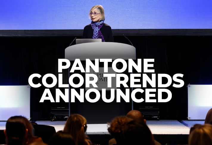
After two years of pandemic shutdowns, consumers are ready to emerge, experience new things, express themselves in new ways and explore the changed world around them, said color expert Leatrice Eiseman, executive director of the Pantone Color Institute, in her annual keynote address at The Inspired Home Show 2022. “More than ever before, there is an ability to connect with our consumer in a very personal way, enabling them to emerge from their personal challenges to experience and express new realities.”
The color combinations in the Pantone®View Home + Interiors 2023–which were unveiled at the Show’s Pantone ColorWatch display–reflect the complexity and diversity of what’s going on in the world around us and what we can expect in the future. Featured colors range from “down-to-earth artisanal tones to highly digitized vibrant hues to intensely robust colors.”
These palettes were designed in part to represent how our physical and digital lives are emerging in new ways. “Digital design, with its vivifying effects, stretch the limits of our imagination, opening a door to a dynamic virtual world where we can explore new color combinations.”
In the art world, Eiseman is excited by the immersive art trend which she says is very intimate and “takes your breath away.” She’s also watching the resurgence of the quirky and colorful style of Niki de Saint Phalle, whose work recently got a new exhibit at MoMA in New York City.
In the entertainment industry, she noted the rich color in the prequel to “Charlie and the Chocolate Factory” movie (due out in 2023) and the regency-style colors, costumes and scenery in the second season of the Netflix series “Bridgerton” (streaming at the end of the month).
The continued strength of the environmental movement offers many applications for color, as well as design and texture. Eiseman is particularly inspired by the use of leftover fruit peels and apple cores to make creative new fabrics.
There are always going to be people who are attracted to neutral colors, she explained. The difference today is that neutrals and high intensity brights can now co-exist.
Likewise, there’s always a need for classic black and white stylings in home and housewares products. Bold red is always a top choice but mixing “rose pinks and bottled greens give black and white a touch of newness these days.”
Mixing the old with the new also was critical when selecting Pantone’s 2022 Color of the Year – Very Peri. “The decision was made to bring a novel perspective and vision to the most reliable, trusted and beloved blue color family around the world,” Eiseman siad. “For the first time, we opted to create a new Pantone blue in order to symbolize our new realities and changing points of view.”
Eiseman concluded her presentation by detailing each of the seven palettes in the Pantone®View Home + Interiors 2023 forecast:
Tropic Refresh – This is your place “to dream big and enjoy, to escape from the challenges of everyday realities,” Eiseman said. Conjuring up images of sky, sand and sea, it offers a balanced feel with both warmth and coolness.
Epic Tales – An escape of a different kind, this palette evokes the esthetic of medieval and mythical past–one that’s been popularized recently in gaming, movies and books. Robust and rich colors are featured, while metallics bring hand-wrought detail.
Honesty – Honesty is a simple color combination that suggests health and wellness. It features neutral colors that are joined by “some nourishing vegetal yellow-green shades that are set off by a sole blue green.”
Earthbound – This palette has a utilitarian look with earth tones mixed with some metallics for an updated approach. It reflects the fact that “people are longing for that ability to reach out and touch right now.”
Unexpected Reality – Lighter pastel shades are contrasted here by, yes, unexpected bright hues including “a vibrant yellow, a sulfuric yellow-green, and a bright orchid.” There is an undertone of technology that energizes this palette.
Artisan Invention – Drawing inspiration from the boho trend and manipulated fabrics, Artisan Invention has “an eclectic effect that is both rustic and sleek.c Mixing the old with the new is a theme here as well.
Intoxicants – It’s all about brightness with Intoxicants, though there’s a bit of mystery involved too. Purple, magenta and violet are joined by red, green, orange and an electric blue to “express celebration and aspiration for better days ahead.”
Get Ready for The Inspired Home Show 2023!
March 4-7, 2023

