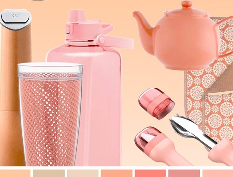
Just last week, global color authority Pantone announced Peach Fuzz as its Color of the Year 2024. Since then designers, home and housewares companies and retailers around the world have been clamoring to learn more about this heartfelt, gentle hue that speaks to body, mind and soul.
“At a time of turmoil in many aspects of our lives, our need for nurturing, empathy and compassion grows ever stronger, as does our imaginings of a more peaceful future,” according to Pantone’s announcement. Peach Fuzz brings “a feeling of tenderness and (communicates) a message of caring, sharing, community and collaboration.”
In our homes, Peach Fuzz has the ability to promote feelings of warmth and comfort. It can be used on walls, in home décor or as an accent within a pattern in our most important and personal environments.
Nestled between pink and orange, the gentle shade “conjures up an air of calm, offering us a space to be, feel and heal and to flourish from, whether spending time with others or taking the time to enjoy a moment by ourselves,” says Leatrice Eiseman, executive director of the Pantone Color Institute. “An idea as much as a feeling, PANTONE 13-1023 Peach Fuzz awakens our senses to the comforting presence of tactility and cocooned warmth.”
Peach Fuzz is a hue that can easily be incorporated into soft or neutral palettes, but it also works well with brighter hues in the pink, orange, blue-green and blue families. And while it offers somewhat of a vintage vibe, the clean peach tone has been rephrased with a contemporary ambiance. Pantone describes it as “sensitive,” “sweet,” “airy” and “quietly sophisticated.”
The introduction of Peach Fuzz marks the 25th anniversary of the Pantone Color of the Year program. Since 1999, the company’s annual color selections have captured the global zeitgeist of the time and given designers, brand companies and retailers a highly effective and timely way to connect with and tap into consumers’ attitudes and desires.
Retailers selling home and housewares products have a unique opportunity to connect with shoppers with trending colors, Eiseman told IHA earlier this year for an article for INSPIRED magazine.
While it may be cost-prohibitive for many shoppers to buy a car in the latest trending color, an item like a toaster in that same hue is an affordable way for them to get in on a trend. In fact, the fact that that toaster is available in a hot new color may actually be what inspires the purchase (whether a new toaster is actually needed or not).
“The huge advantage for the home and housewares industry is that we’re not talking about big-ticket items,” explains Eiseman. “Even high-end dinnerware doesn’t compare in price to a new car or carpeting throughout your home.”
When marketing or merchandising, retailers can also use items in trending colors to draw attention to other popular home items in clear glass or stainless steel.
“On the retail floor or even online, the eye tends to gloss over neutrals,” explains Eiseman. “They tend to become part of the background. You’ve got to use some form of contrast, perhaps a trending color or something more unusual, to draw a shopper’s attention to them.”
Pantone will reveal color palettes in the Pantone® View Home + Interiors 2025 forecast at The Inspired Home Show 2024, and Lee Eiseman will be featured in a keynote address. Learn more about the Show, which takes place March 17-19 in Chicago.

